Citi Mobile App
Citi Mobile App - iOS & Android

Citi Mobile App Re-design
We made updates to the Citi mobile app (iOS and Android) with a “mobile-first” approach, adding features that are contextually relevant and dynamic.
We wanted to improve the app so users can easily complete their tasks, with the goal of improving customer service and increasing NPS score.
The Problem
"40% of (Citi) mobile users think it is 'somewhat difficult' or 'difficult' to find what they need."
MOBILE CONTENT SURVEY, OCT 2017
We partnered with McKinsey & Co. to conduct an online survey of ~530 mobile customers who used the app within the past month. They also surveyed current mobile app satisfaction and impact of key app elements, such as navigation, user interface, feature accessibility.
SURVEY RESULTS
Mobile app satisfaction has ~20 pts of NPS improvements to catch up with industry leaders
Speed of access of features and navigation was top element to improve
40% of mobile users find it 'somewhat difficult' or 'difficult' to find what they need
Introducing a "dynamic menu" would result in a better mobile experience for ~80% of customers
Evolving and Improving Our Current Mobile App
Taking this information, we determined a "dynamic" menu would serve up actions and information to the user, instead of having them seek it out themselves. This is based on top user actions, such as making a payment, transferring funds, or locking a card.
User testing
We conducted 3 rounds of user testing in three different markets (New York City, Austin, and Chicago) to get feedback on how users prefer to see alerts and is successful and clear. We tested UX/wires in the first round, then UI in the last 2 rounds.

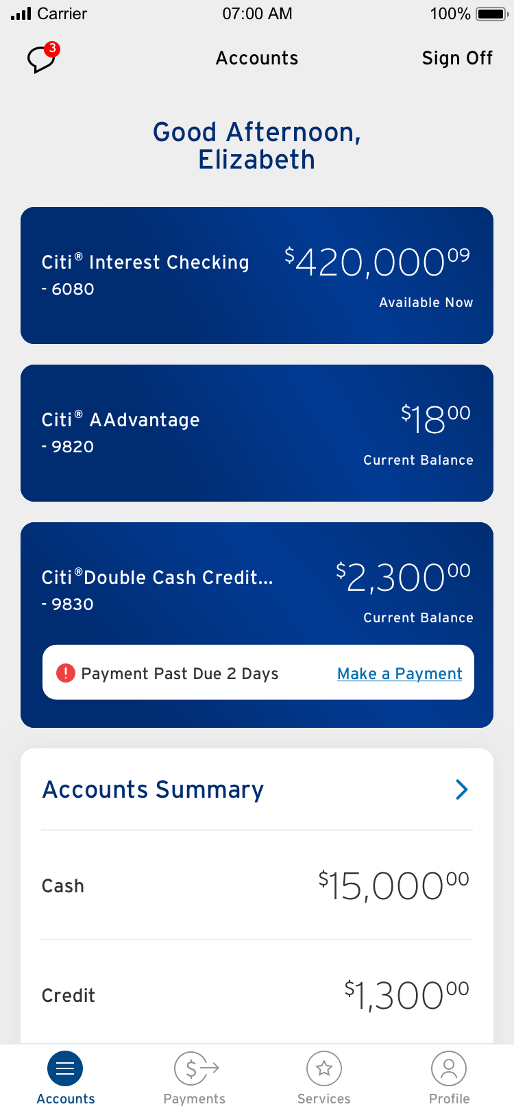
CITI Dashboard, Previous
The current dashboard only surfaces a few alerts, such as a locked card or missed payment. The user needs to proceed into the ledger view to address such alerts.

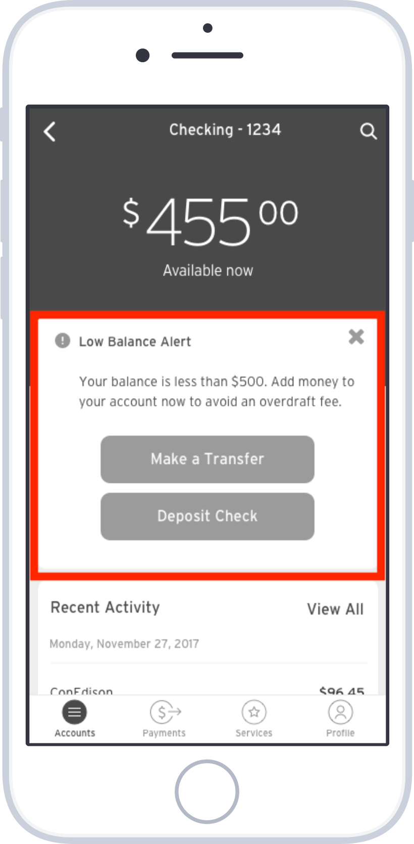
CITI Ledger, Previous
The checking ledger today informs the user if the balance falls below a pre-determined amount. If the user would like to transfer funds or deposit a check to increase the balance, they will have to go through the bottom nav.

CITI Dashboard, Dynamic
In the dynamic dashboard, we are pairing an alert with a CTA, so the user can address the situation immediately.
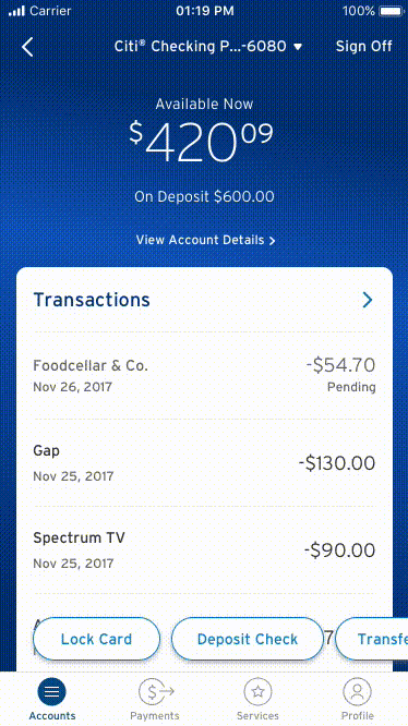
CITI Ledger, Dynamic
The dynamic ledger will surface up relevant CTAs alongside alerts, so it's front and center for the user.
Key takeaways
Adding meaningful functionality to the existing experience - rather than complete reinvention - offered the best of what's familiar and novel
Not just surfacing alerts, but providing relevant context and CTAs, was critical and differentiating
Providing “dynamic” messages in-line with accounts added real value to the customer experience
Modular Framework
We introduced a modular tile system for several uses, such as upcoming payments, marketing, transactions view, and rewards.


UI Treatment
Then, partnering with our product owners to ensure business needs are met, we recreated the baseline views of dashboard and ledger. We went through several design iterations based on atomic design and landed on a clean and simple UI treatment. The new designs are more scalable and can accommodate alerts and CTAs front and center.
UI Exploration Phase


Adding "Dynamic" Features
We created scenarios based off user stories, and began to layer in features that enable the user to get to their end goal in a timely and efficient manner.

Final Designs


MVP Launch
Google Play store Reviews
Amazing app. Can do all the work and transactions without even going to the bank. - Touseef Ali (3/12/19)
This app is great for keeping track of transactions. It's so easy to catch fraudulent charges. - Kathy Whoolery (3/12/19)
With the recent improvements, this is now the smoothest and easiest to use of all my banking apps. - Don Henry (3/11/19)
Apple APP Store Reviews
I want an app that’s easy to navigate and if I need extra features I don’t have to go on a scavenger hunt to find them. Check and check. Great job Citi - rwiby99 (3/7/19)
The new update is really cool. There’s some easy to find buttons at the bottom that let me lock my card or deposit a check. The new look is also very cool. - Frumpkin (3/6/19)
It is really easy to make a payment, see your reward amount, see what you have spent and when. Like it a lot! - Hampshirite (3/4/19)